/ Updated: — Chris Cid
Introducing “Ions”, an extension to the Atomic Design
Adding a third dimension on the Atomic Design components relations.
On my previous article “Atomic Design for Design Systems” I wrote my experiences adapting the Atomic Design on building Design Systems and on the benefits gained to build systems that can grow successfully.
But, something is missing…
While Atomic Design is providing a feasible, easy to understand and adapt solution on the component’s structure, I often felt that it can be improved.
Atomic Design should continuously be a solid solution when a project becomes larger, always simplifying the complexity of a growing component library. More importantly, Atomic Design should always support the efficiently on adjusting and adapting a living Design System.
The influence to created Ions
The initial motivation to create “Ions”, was that people who are building Design Systems —including myself— where often missing details on the component’s structure. Details that are important for the overall structure, and also for the output consistency and quality.
At the same time, I had experienced Design Systems where the components structure suffer from providing massive amound of variations, becoming difficult to keep them organized, creating inconsistencies, and most importantly, becoming difficult to communicate and inefficient to be used by the Design System end users.
All types of components —either are Atoms, Molecules, or Organisms— are sharing sets of properties which are not captured by the Atomic Design structure.
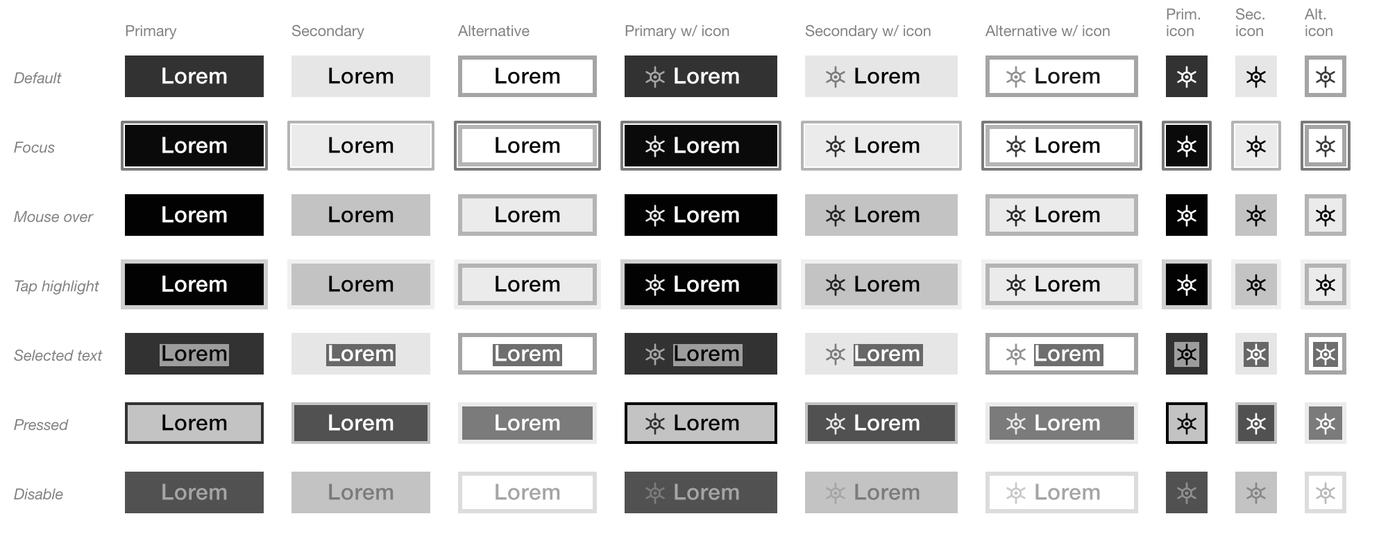
These properties and their resulted variations can be easily illustrated if we think of a basic Atom: a button.
― Let’s assume that we need 3 styling variations for a button:
- Primary
- Secondary
- Alternative

― And then, 3 different content variations:
- Text label
- Text label with icon
- Icon only

― On top of that, add all the possible interactions, such as:
- Default
- Focus
- Mouse over
- Tap highlight
- Selecting text
- Pressed
- Disable

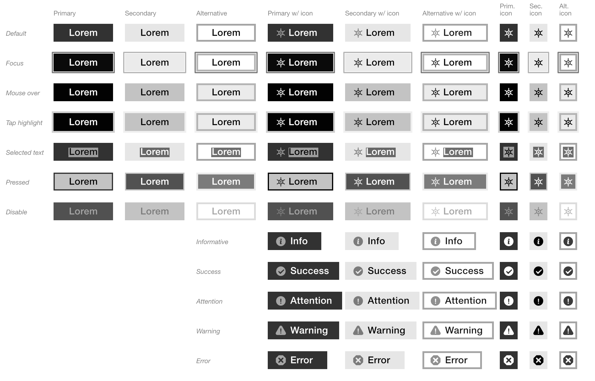
― Also, the different statuses after people interact with them:
- Informative
- Success
- Attention
- Warning
- Error

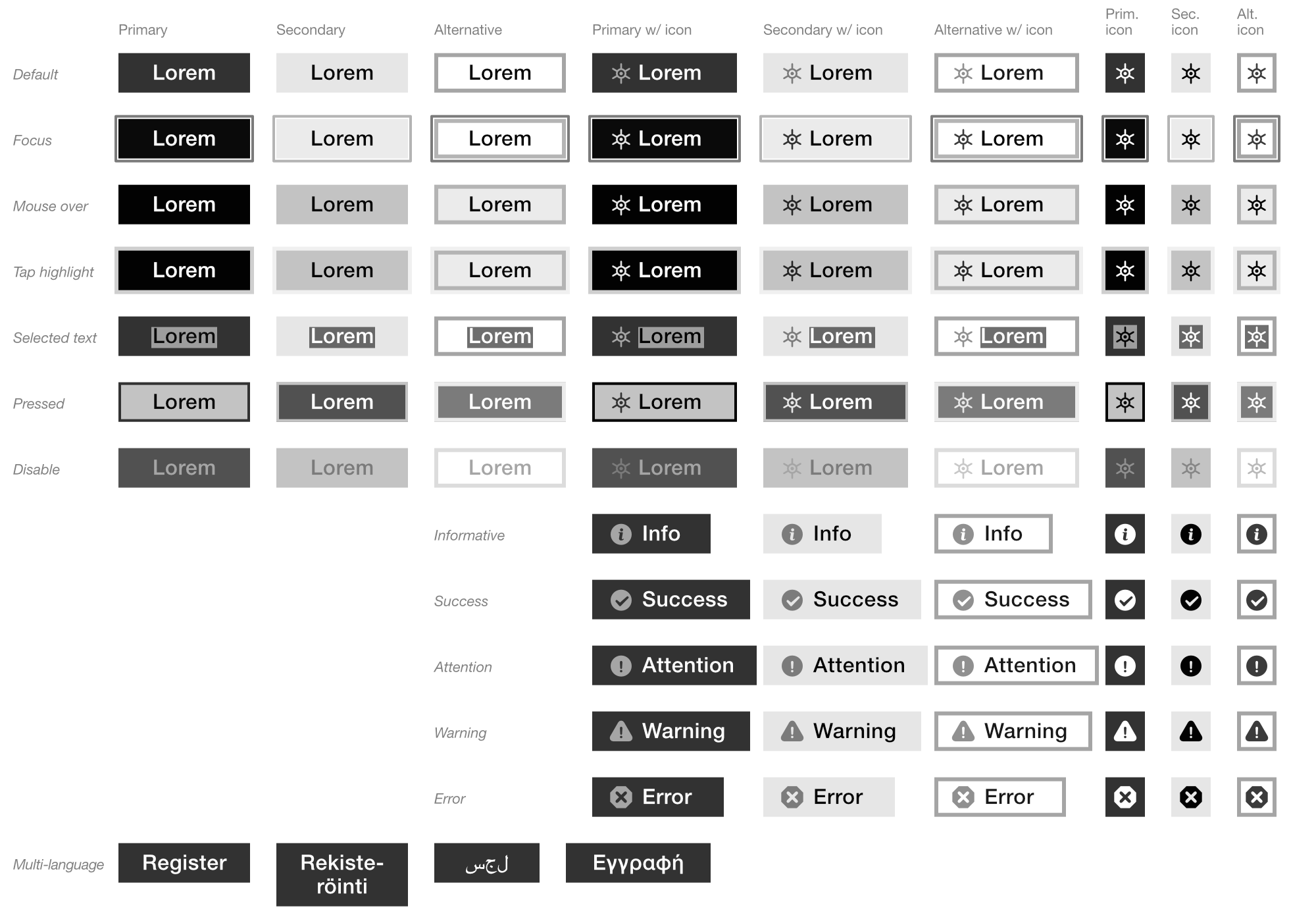
― For a global projects, we also need to support different languages and writing systems:
- Multiline labels
- Right to left

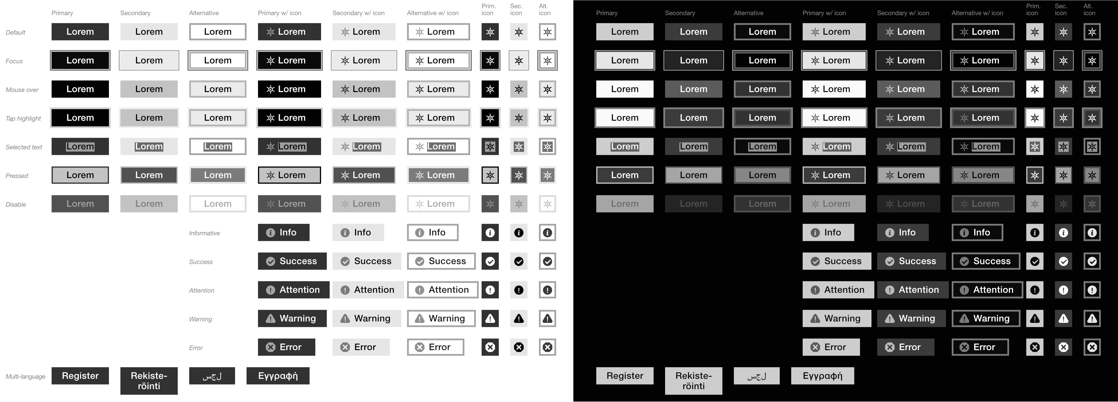
― Finally, since we now also have “color schemes” —aka Dark UI—, all the above variations can be easily doubled:

That is a hell a lot of variations that we need to build, maintain and communicate.
Now, imagine that as a Design System user, I just want to use a button; and when I open a Sketch library, I am facing more than 190 variations for just a button!
Even a simple Atom can have that many variations, resulting to a massive component library that becomes difficult to navigate, difficult to understand the use cases of all these variations, and as a result, difficult to consume as a pattern library.
As the Design System grows, we need to always keep these properties aligned, in order to keep consistent output. For example, a “disable” button, should share —at least— a similar logic with a “disable” input field.
By providing hundreds of variations for any component, it is a matter of time to create inconsistencies.
What are the Ions
Ions is an additional layer, on top of the Atomic Design.
Ions is the place where we can store all the properties that can be applied to some, or all components, either are Atoms, Molecules, or Organisms. Being an additional common repository of properties that can be shared among components of the Atomic Design hierarchy; while at the same time, removing the complexity of embedding these properties within the Atomic Design structure.
Examples of Ions
To understand the benefits and power of Ions, let’s take a look on some use cases.
Atom: Button
As we describe earlier, a button has quite a lot of properties that we need to define. While we describe the Ions of a single Atom, a “button”; these Ions can be shared both with other Atoms, and also with Molecules and Organisms.
Molecule: Buttons group
Molecules consist as a combination of Atoms. Ions are helping us to verify that each Atom with its related Ions, continues to provide a solid UI against other Atoms within the Molecule.
As example, we can think of a group of buttons where one is primary and the other is secondary. By applying to each Atom all the related Ions, we can quickly verify that any combination of Atoms with its Ions, continues to provide a clear message to the user.
We might find that the disable primary button shares a similar UI with the secondary button next to it. In that case, we can easily go back to the “disable” Ion that is applied on this Atom, and adjust the styling to differentiate enough from the secondary default button.
Organism: Registration form
On the Organism level, we can validate additional functionality, based even on user stories.
For example, in a registration form that contains —among others— a group of buttons, we can validate how a required field error with its message, performs as UX and UI against applicable Ions.
Ions on the whole range of the Atomic Design
Most Ions should be defined at the Atom level. That doesn’t mean that Ions are only for Atoms. There are plenty of cases that Ions are for Molecules or Organisms but not for Atoms. Some examples can be…
Ions for Molecules
An accordion menu is a case that we need to assign Ions on the Molecule level only.
Ions such as, “Multiline labels” and “Narrow viewport” for small mobile screens, to validate that long labels that renders in 2 or more lines remains legible, while the alignment with the icon next to them, remains correctly aligned with the text label, communicating a clear message for the accordion status — i.e. is expanded or collapsed.
Ions for Organisms
A situation‐based Ion, such as “Mobile with one hand usage” is a common case for an Organism only Ion.
In this example, we can verify if a form or navigation Organism provides a structure that allows users to hold a device and perform the expected actions, using only one hand.
How Ions can improve UX
Ions can become the main tool to validate a wide range of UX related scenarios.
Ions for personas
Personas are a group of “properties” assign to a fictional person, creating users to helps us test, prioritize and validate scenarios and user stories.
These “properties” can assigned to existing Ions, or even generate additional Ions.
Since each Ion should always assigned to —at least— one component, by connecting personas with Ions, we are actually creating trackable connections with the related components. Combining that with the Atomic Design structure, we can track personas informations down to the Atom level of components; enabling us to resolve conflicts or any persona related issue, on the core level of the component structure.
Ions and Unit Testing
On software development, unit testing is a “must have” method to track and resolve issues based on different data or procedures. Unit testing is based on testing these “properties” on various realistic, or even extreme scenarios.
These also “properties” can be assigned to existing Ions, or again, generate new ones.
Even more interesting use case, is that Ions can play the role of unit testing on the UX and UI design side. Creating an omnichannel between UX, UI and development, sharing the same automations on testing and validating.
Ions for Design Languages
Design Languages are built around concept and principles, based on the corporate or product vision. Usually Design Languages also are integrating business metrics (such as KPIs).
All these informations, that are the backbone of a Design Language, consist of high‐level “properties”, that can be also assigned as Ions; connecting them with the component structure.
Ions categories
Since Ions consist of diverse type of properties that can —and should— increase as a Design System is growing, is highly recommended to organize them within categories.
Note: The list bellow links to detail tables, to provide (highly opinionated) examples.
-
- Modes
- For the various display types and entries methods.
-
- Viewports
- For the different screen sizes.
-
- Styles
- For all UI stylings.
-
- Variations
- For multi‐language or content variations.
-
- Types
- For the information types.
-
- States
- For all states of interactive elements.
-
- Statuses
- For all statuses of interactive elements.
-
- Situations
- For situations on use cases or environments.
Why “Ions”
In physics, ion is in fact a kind of property for the electrical charge of the actual atoms and molecules. Also I found that as a term, “Ions” is a well known word for non‐English speakers.
Since I believe Ions can become a very powerful tool, when are placed within an Atomic Design structure, it was an easy and obvious decision on starting using this term.
Conclusion
Ions are a repository to manage the variety of properties that any component can have.
By separating these properties from the main structure of the Atomic Design, we ensure that we are keeping a straightforward structure of components, being always easy to understand their hierarchies and relations.
Ions can be a very powerful tool when we assign them dynamically with the Atomic Design structure — e.g. through JSON mapping. So that at any point, we can track relations both between Ions and components, but also between Ions and the Atomic Design structure. By that, Ions can play a critical role on the scale and growth of any Design System.
Finally, Ions can hold information for various types of UX, IA, Design Language, even high‐level business metrics. Becoming a critical tool to manage, test, measure and validate almost any type of information related to a Design System.
Endnote tables
Here I am listing Ion categories with some proposed items, based on personal experiences building Design Systems.
These Ions doesn’t mean that are essential for every project or product. Instead I highly recommend to use them as a reference, to start build your own Ions, that fits better for your product.
Modes
| Mode | Description | CSS selectors |
|---|---|---|
| Screen | Screen‐based devices, including projectors. |
|
| Pointer | Devices with mouse, trackpad, or other pointing device with high level of accuracy. |
|
| Touch | Touch‐based devices with limited accuracy. |
|
| Printer friendly version. |
|
|
| Pixel density | Devices with low or high pixel densities. |
|
| Color depth | Devices with limited or wide range of color reproduction. |
|
| Low contrast | Devices with low or high contrast screens. |
|
| Monochrome | Devices, such as e-papers, with monochrome displays. |
|
| Fullscreen | Fullscreen components or pages. |
|
Viewports
| Viewport | Description | Widths or CSS selectors |
|---|---|---|
| Ultra narrow |
|
0 – 19,9375 em
0 – 319 px
|
| Extra narrow |
|
20 – 29,9375 em
320 – 479 px
|
| Narrow |
|
30 – 59,9375 em
480 – 959 px
|
| Wide |
|
60 – 89,9375 em
960 – 1439 px
|
| Extra wide |
|
90 – 119,9375 em
1440 – 1919 px
|
| Ultra wide |
|
120 + em
1920 + px
|
| Orientation | Device orientation |
|
| Aspect ratio | Viewport aspect ratio |
|
Styles
| Style | Description |
|---|---|
| Primary | CTA elements. |
| Secondary | Substitute action elements. |
| Alternative | Low priority or supplementary action elements. |
Variations
| Variation | Description |
|---|---|
| Long wordings. | For languages —such as German or Finnish— that occasionally renders long wordings. |
| CJK | For writing systems with fixed letter body — i.e. Chinese, Japanese, and Korean. |
Types
Types is the Ion category for different information types provided to users.
- Normal
- Emphasized
- Informative
- Warning
- Alert
- Error
- Success
States
| State | Description | CSS selectors |
|---|---|---|
| Default |
The preselected value.
Applied to: buttons, radios, checkboxes, options. |
|
| Placeholder | Example prompt for empty user input elements. |
|
| Empty | Empty (blank) user input elements. |
|
| Indeterminate | Applied to: radios, checkboxes and progress. |
|
| Checked | Applied to: radios, checkboxes and options. |
|
| Optional | Applied to: input, select and textarea elements. |
|
| Required | Applied to: input, select and textarea elements. |
|
| Disable | Disable elements that cannot activated or accept focus from users. |
|
| Enable | The (by default) enable elements that users can activate or focus. |
|
| Editable | Elements that are editable from users. |
|
| Read only | Elements that users cannot change its content. |
|
| Valid | For user entered content that is validate successfully. |
|
| Invalid | For user entered content that fail to validate. |
|
| Within range | Within range limits specified with min and max properties. |
|
| Out of range | Outside from the range limits specified with min and max properties. |
|
Statuses
| Status | Description | CSS selectors |
|---|---|---|
| Initial | The initial status of any component. | |
| Text selection | For when users are selecting text. |
|
| Hover | For pointing device, is the action to hover curson on a component. On touch devices, is the action to tap on a component. |
|
| Tap highlight | It appears over a link while it’s being tapped. |
|
| Focus | User tap, click or select with keyboard on interactive element. |
|
| Active | When interactive element is activated. |
|
| Unvisited | Any link that is not yet visited. |
|
| Visited | Already visited links. |
|
Situations
| Situation | Description | CSS selectors |
|---|---|---|
| Color scheme | Preference on light or dark color themes. |
|
| Reduced motion | People that prefer limited motions. |
|
| Single hand | People that occasionally or premaritally use one hand to interact with devices. | |
| Keyboard navigation | People that are using occasionally or premaritally keyboard to navigate content. |
Naming tip
Avoid to share same Ion wordings between different categories.
By repeating the same wording in different categories, can easily occur to mislead for which item we refer to.
For example, the “default” Ion is highly recommended to be used only in one category. On the above examples, I am using the “default” within the State category only.
In other categories —instead of “default”— wordings that can be used are:
- “Regular”
- “Standard”
- “Normal”
- “Main”
- “Initial”
- “Neutral”
Approved by Brad Frost!
My sincerely thanks to Brad Frost for taking the time to go through this article and writing a post about it: Extending Atomic Design | Brad Frost.